Have you ever tried an eyeshadow color that looked beautiful in the palette but somehow made you look exhausted the moment you applied it?
Most people assume tired-looking eyes are caused by lack of sleep, stress, or dark circles. While those things certainly matter, eyeshadow color can sometimes have an even bigger impact than people realize.
In fact, many people spend years blaming their skin, their eye shape, or their makeup skills when the real problem is much simpler.
The color itself is working against them.
What’s interesting is that there isn’t one single eyeshadow shade that makes everyone look tired. The problem is usually a mismatch between the eyeshadow and the person’s natural coloring.
A color that makes one person look fresh and expensive can make someone else look dull and worn out.
That’s why makeup advice can feel so confusing.
One person swears by warm brown eyeshadow.
Another insists cool taupe is the answer.
Both can be right.
The difference is personal color.
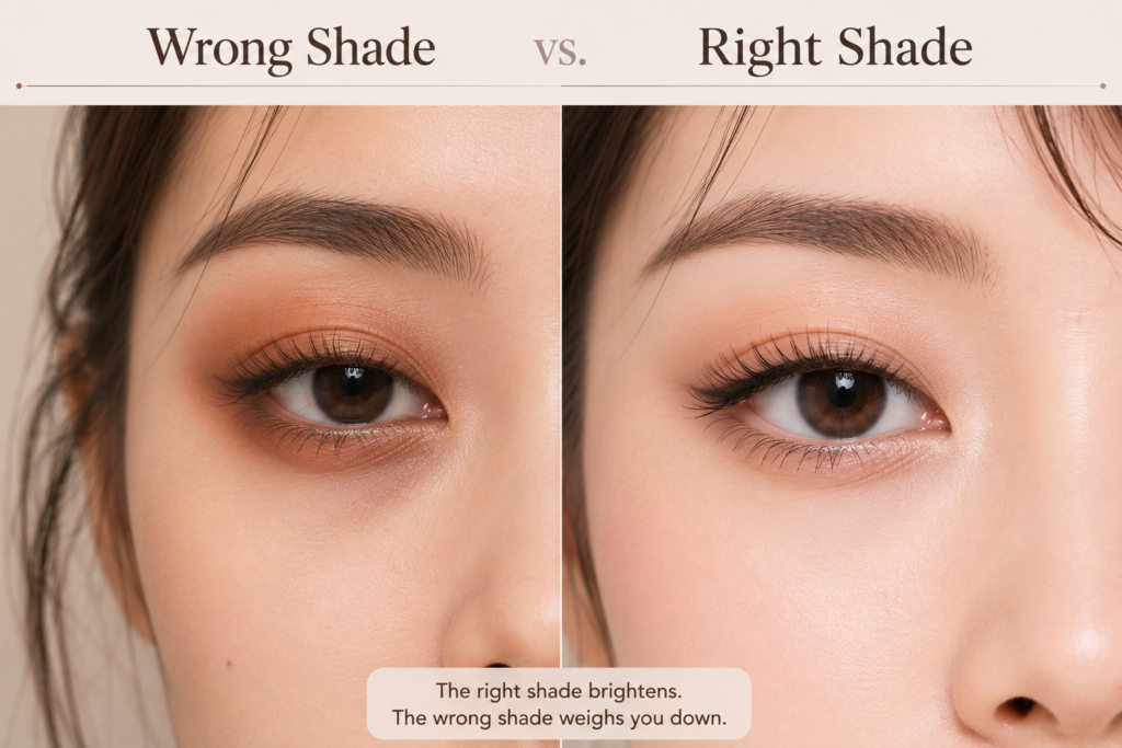
One of the biggest offenders is overly warm orange-brown eyeshadow.
A few years ago, warm eyeshadow palettes became incredibly popular. Suddenly every brand released collections filled with copper, terracotta, caramel, and burnt orange shades.
On the right person, these colors look stunning.
They create warmth, depth, and a healthy glow.
But on cooler complexions, that same warmth can make the skin appear:
- redder
- yellower
- duller
- more uneven
Instead of looking healthy, the face can start looking tired.
The opposite problem happens with cool gray eyeshadow.
Cool taupe and gray-brown shades are often praised for looking sophisticated and elegant.
And they can.
But when someone with strong warmth in their skin wears a cool gray shadow, the result can feel lifeless.
The eyes lose brightness.
The skin loses warmth.
Everything suddenly feels a little flat.
This is why gray eyeshadow is often described as either magical or terrible, depending on who is wearing it.
Pink eyeshadow creates another common challenge.
Pink can be beautiful and romantic, which explains why it never completely disappears from beauty trends.
The problem is that certain pinks can mimic the appearance of irritation around the eyes.
Some shades make it look as though you’ve been crying, rubbing your eyes, or suffering from allergies.
This doesn’t happen to everyone.
But when the undertone is wrong, the effect can be surprisingly strong.
Many people discover this after buying a trendy pink palette and wondering why they suddenly look unwell.
Purple shades can be tricky too.
Soft lavender often looks fresh and modern.
Deep plum can create beautiful depth.
But certain cool purples may emphasize shadows around the eyes if they are not balanced properly.
The result can resemble dark circles rather than intentional makeup.
Even beige can cause problems.
People often think neutral colors are automatically safe.
Not always.
A beige that’s too similar to your skin tone can remove natural contrast from the face.
Instead of creating definition, it can make the eyes seem smaller and less expressive.
The makeup doesn’t look bad exactly.
It just doesn’t do very much.
This is one reason professional makeup artists often focus on contrast rather than color alone.
The goal is not simply applying eyeshadow.
The goal is creating enough depth and brightness to make the eyes stand out naturally.
Lighting makes all of this even more confusing.
A color that looks soft and flattering indoors may suddenly appear completely different in daylight.
Warm shades become warmer.
Cool shades become cooler.
Undertones become much more obvious.
This is why some eyeshadow looks seem perfect in the bathroom mirror but disappointing once you step outside.
The most flattering eyeshadow usually isn’t the trendiest color.
It’s the one that makes your eyes appear brighter than the shadow itself.
When the color is right, people notice your eyes.
When the color is wrong, people notice the makeup.
That’s a useful rule to remember.
The next time an eyeshadow palette feels strangely unflattering, don’t assume the product is bad.
And don’t assume you’re applying it incorrectly.
Sometimes the issue isn’t technique at all.
Sometimes it’s simply a matter of finding the colors that naturally work with your face instead of fighting against it.
Once you discover those shades, makeup starts feeling much easier—and your eyes suddenly look more awake without any extra effort.
Soft Glam vs Natural Makeup: What’s the Difference?
Pink Eyeshadow: Pretty, Romantic, or Just Puffy?
Leave a Reply