Neutral Undertone: What If You’re In Between? (And Why That Might Be Your Advantage)
At some point in the process of identifying your personal color, you may find yourself hesitating.
Not because you lack information, but because nothing feels entirely definitive.
Warm tones seem to work—sometimes.
Cool tones don’t look wrong either.
And yet, neither category feels like a perfect fit.
This is often where the concept of a neutral undertone becomes relevant.
And more importantly, where many people begin to realize that personal color is not always about clear distinctions, but about subtle balance.
What It Means to Be Neutral
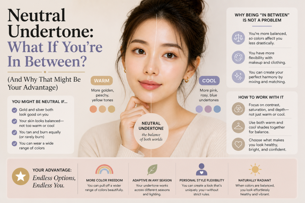
A neutral undertone does not sit firmly within the traditional warm–cool spectrum.
Instead, it exists somewhere in between.
The skin does not strongly reflect golden warmth, nor does it lean distinctly toward pink or blue.
Rather, it maintains a certain equilibrium—one that allows a broader range of tones to coexist without obvious conflict.
This is why individuals with neutral undertones often experience less dramatic shifts when testing different colors.
The contrast is softer. The difference more nuanced.
And while this can make identification more difficult, it also introduces a level of flexibility that is often overlooked.
Why It’s Harder to Identify
Unlike clear warm or cool undertones, neutrality rarely presents itself through strong visual cues.
There is no immediate “this looks better” moment.
Instead, the differences appear gradually:
- one color may feel slightly more refined
- another slightly more muted
- some tones may appear balanced, but not particularly striking
This subtlety can be misleading.
Many assume that if they cannot clearly distinguish between warm and cool, they must simply be observing incorrectly.
But in reality, the absence of a strong reaction is often the signal itself.
The Illusion of “Everything Works”
One of the most common assumptions about neutral undertones is that “everything works.”
And to some extent, this is true.
Neutral undertones tend to be more forgiving. They do not clash easily.
But this does not mean all colors are equally effective.
There is still a difference—just a quieter one.
Some colors will:
- soften your overall appearance
- create a more seamless transition between skin and clothing
While others may:
- slightly dull your complexion
- reduce the natural definition of your features
The goal, then, is not to find contrast, but to identify consistency.
Balance Over Temperature
For neutral undertones, the focus shifts away from temperature alone.
Instead of asking whether a color is warm or cool, a more useful approach is to consider:
- depth
- saturation
- clarity
A color may technically fall within the “correct” temperature range, but still feel off if it is too intense or too muted.
This is where many neutral individuals discover that what works best for them is not a strict category, but a controlled balance.
Colors that are slightly softened, slightly desaturated, or gently blended often create the most harmonious effect.
Why Neutral Can Be an Advantage
While the lack of clear definition may initially feel like a limitation, neutrality often becomes an advantage over time.
Because there is more flexibility, there is also more room to experiment.
Neutral undertones can move between palettes with greater ease.
They can adapt to different styles, seasons, and trends without requiring drastic adjustments.
This adaptability is particularly valuable in modern styling, where rigid categories are becoming less relevant.
Instead of being confined to a narrow range, neutrality allows for a more fluid, intuitive approach to color.
Reading Subtle Signals
Since neutral undertones rely less on obvious contrast, it becomes important to pay attention to smaller details.
Look beyond the immediate impression and observe:
- how your skin looks after a few minutes
- whether certain colors make your features appear softer or sharper
- how your overall expression changes
Often, the most suitable colors are not the ones that stand out immediately, but the ones that feel the most natural over time.
Letting Go of Labels
One of the most useful shifts you can make is to move away from the need for a fixed label.
“Warm,” “cool,” or “neutral” are helpful reference points—but they are not definitive identities.
They are starting points.
For neutral undertones especially, the goal is not to categorize, but to understand.
To recognize patterns. To build familiarity.
And to develop a sense of what feels aligned, rather than what simply fits a predefined system.
A More Refined Perspective
As your awareness of color deepens, the question becomes less about classification and more about intention.
You begin to notice how certain tones influence not just your appearance, but the mood you convey.
A slightly cooler shade may create a more composed, structured look.
A slightly warmer tone may introduce softness and approachability.
For neutral undertones, this becomes a tool rather than a limitation.
Color is no longer something you adapt to—it becomes something you choose, depending on the impression you want to create.
Final Thoughts
Being in between does not mean being undefined.
It means having the ability to move.
To adjust. To interpret.
And to engage with color in a way that is less about rules, and more about awareness.
Because ultimately, personal color is not about finding a category that explains you.
It is about understanding how color interacts with you—and using that understanding with intention.
And in that sense, neutrality is not the absence of direction.
It is the presence of possibility.
Leave a Reply