There’s a moment most people have experienced, though not everyone knows how to explain it.
You put on something new — a color that felt right when you saw it in the store, something that looked polished, modern, even a little expensive. It might be trending everywhere, the kind of shade that seems to dominate every rack and every curated feed.
And yet, when you finally wear it, something feels slightly off.
Not wrong enough to reject it immediately, but not right enough to ignore either.
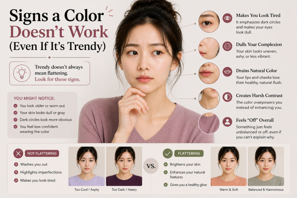
Your skin looks a little dull. Your face seems less defined. You catch your reflection more often than usual, not out of admiration, but out of quiet uncertainty.
Most people don’t blame the color.
They blame themselves.
Maybe it’s the lighting. Maybe it’s their skin that day. Maybe they didn’t sleep enough, or maybe their makeup just isn’t sitting right. So they adjust — a bit more concealer, a different lip, a quick attempt to “fix” what feels off.
But often, the issue isn’t what you added.
It’s what you’re wearing.
Color has a way of behaving quietly. It doesn’t demand attention the way silhouette or texture does. It doesn’t announce itself as the problem. Instead, it works in the background, reflecting light upward, subtly interacting with your skin tone in ways that are easy to overlook but impossible to unsee once you notice them.
When a color doesn’t suit you, the effect is rarely dramatic. It’s cumulative.
Your complexion may appear slightly uneven, even if your skin is in good condition. Redness becomes more visible, shadows deepen, and areas that usually look balanced begin to feel disconnected. The natural structure of your face — the contrast between light and shadow — becomes less defined.
It’s not that the color is “bad.”
It’s that it’s working against you.
This is where many people get confused. They assume that if a color is beautiful, it should translate universally. If it looks good on someone else, especially someone with a similar style or complexion, it should work for them too.
But color doesn’t function like that.
It doesn’t adapt.
It reacts.
And your skin, with its unique undertone and depth, responds differently than anyone else’s.
This is why a muted taupe can make one person look effortlessly refined, while on someone else it reads as flat or lifeless. Why a crisp, cool gray can feel sharp and elegant on one face, but slightly draining on another.
The difference isn’t taste. It isn’t styling skill.
It’s compatibility.
One of the clearest signs that a color doesn’t work for you is the way it changes the perceived energy of your face. You may look more tired than you actually feel. Your features might seem softer in a way that lacks clarity, not in a flattering, diffused sense, but in a way that feels slightly blurred.
Even your makeup can begin to behave differently.
A foundation that usually looks seamless may suddenly feel heavier. A blush that normally brightens your face might look misplaced or overly obvious. Lip colors that you trust might start to feel disconnected, as if they belong to a different version of your face.
When that happens, it’s easy to assume the products are the issue.
But often, the base — the color closest to your face — has already disrupted the balance.
Another subtle but telling sign is how much effort it takes to make everything else work. If you find yourself adjusting multiple elements — hair, makeup, accessories — just to make a single outfit feel right, there’s a good chance the color is not naturally supporting you.
The right color doesn’t require that kind of negotiation.
It simplifies.
It allows your skin to appear clearer without correction, your features to stand out without exaggeration. It creates a kind of visual alignment where everything feels cohesive, even if the overall look is minimal.
This is why truly flattering colors often feel almost underwhelming at first.
They don’t shout.
They don’t demand attention.
They simply make you look like yourself — but slightly more refined, more balanced, more awake.
And once you start recognizing that feeling, it becomes difficult to ignore.
Trends will continue to shift. There will always be a new palette, a new “it” shade, a new seasonal favorite that promises to update your wardrobe instantly.
But not every color is meant for every face.
Understanding that isn’t about limiting your choices.
It’s about refining them.
Because when you stop asking, “Is this color popular?” and start asking, “What does this color do to my skin?”, you move from following trends to understanding yourself.
And that’s where personal style begins to feel effortless.
Leave a Reply