Why Certain Colors Make You Look Tired (Even If You’re Not)
There are days when you slept well, your skin feels fine, and yet something still looks… off.
You look in the mirror and wonder why your face seems dull, slightly uneven, or just not as fresh as usual.
Most people assume it’s because of lack of sleep, stress, or skin condition.
But sometimes, the real reason is much simpler.
It’s the color you’re wearing.
The Subtle Effect You Rarely Notice
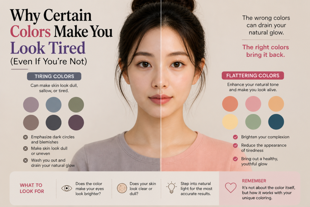
Color doesn’t just sit on your body.
It reflects onto your face.
Every fabric you wear interacts with your skin in ways that are often too subtle to consciously notice — but impossible to ignore once you become aware of it.
Some colors naturally enhance your complexion.
They make your skin appear smoother, more even, and quietly radiant.
Others do the opposite.
They can exaggerate shadows, highlight redness, and make your skin look more tired than it actually is.
And the frustrating part?
It’s not always obvious at first glance.
Why “Trendy” Doesn’t Always Mean “Flattering”
One of the most common mistakes people make is assuming that if a color is popular, it will look good on them.
But personal color doesn’t work that way.
A trending shade — whether it’s a muted beige, a cool gray, or a bold neon — doesn’t adapt to you.
Your skin reacts to it.
That’s why you might try on something that looks stunning on someone else, only to feel like it doesn’t quite suit you.
It’s not about taste.
It’s about compatibility.
The Difference Between “Nice Color” and “Right Color”
A color can be objectively beautiful and still not be right for you.
This is where most people get confused.
They judge a color based on how it looks on the hanger, or how it appears on someone else.
But the only thing that matters is how it interacts with your face.
The right color will do something very specific:
It will make your skin look clearer without effort.
It will reduce the appearance of shadows around your eyes.
It will make your overall look feel more balanced — even without makeup.
The wrong color will do the opposite, but in a way that’s easy to misinterpret.
You might think your skin looks dry, or your makeup isn’t working.
In reality, it’s the color disrupting the balance.
What Happens When a Color Works Against You
When a color doesn’t match your undertone, it creates subtle visual tension.
Your skin may appear slightly grayish or uneven.
Redness may become more noticeable.
Dark circles can look deeper than they actually are.
Even your facial contours can appear less defined.
None of these effects are dramatic on their own.
But together, they create the impression of looking “tired.”
This is why two people can wear the same outfit and look completely different.
The difference isn’t the outfit.
It’s how their skin responds to the color.
Why It Feels Hard to Pinpoint
If you’ve ever struggled to figure out why something doesn’t look right, this is probably why.
The effect of color is not loud.
It’s quiet, layered, and cumulative.
You don’t immediately think, “This color is wrong.”
Instead, you think:
“Maybe I need more makeup.”
“Maybe my skin condition is off.”
“Maybe I just look tired today.”
But sometimes, none of those are true.
A Small Shift That Changes Everything
Once you start paying attention to how your face reacts to color, everything becomes clearer.
Instead of asking, “Do I like this color?”
You begin to ask:
“Does this color make my skin look better?”
That shift is subtle, but powerful.
It removes guesswork.
It makes shopping easier.
It simplifies styling.
And most importantly, it helps you understand your own visual balance.
Final Thoughts
Looking tired isn’t always about your skin, your sleep, or your routine.
Sometimes, it’s just the wrong color sitting too close to your face.
And once you recognize that, you stop trying to fix the wrong problem.
You start choosing better colors instead.
Leave a Reply