Have you ever looked in the mirror wearing a certain color and thought,
“Why do I suddenly look exhausted?”
Sometimes it happens even after getting enough sleep, doing your makeup carefully, or styling your hair the same way you always do. The strange part is that nothing about your face actually changed — but somehow your entire appearance feels duller, heavier, or less alive.
Very often, the reason is color.
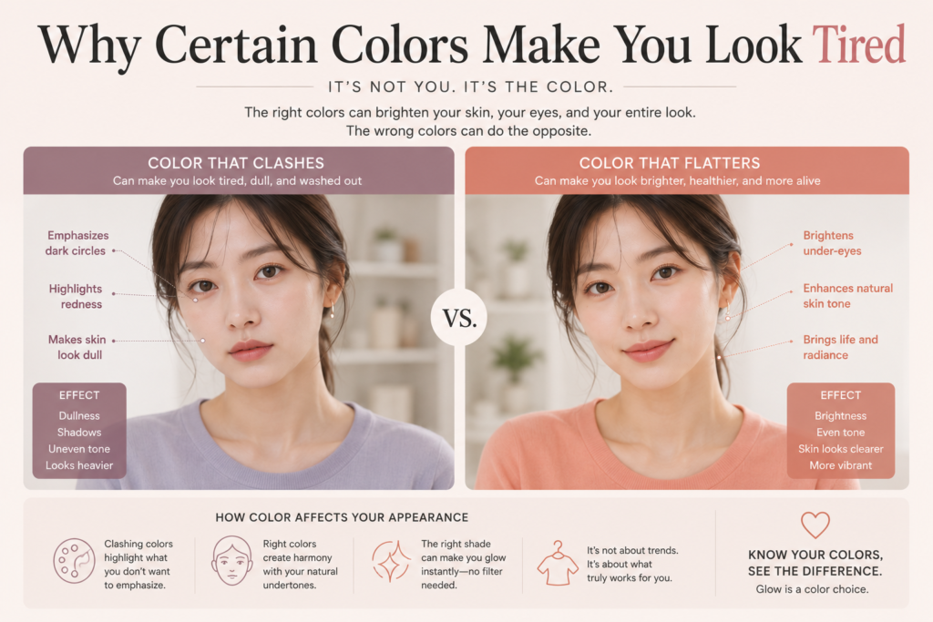
Certain colors naturally work with your skin tone, while others fight against it. When a color clashes with your natural undertones, it can exaggerate shadows, redness, uneven skin tone, and signs of fatigue without you realizing it.
This is one reason personal color analysis became so popular in beauty and fashion. People started noticing that some shades made them glow instantly, while others made them look tired no matter how attractive the outfit itself was.
Why Color Changes Your Face So Much
Your face constantly reflects light.
The colors you wear near your face affect how light bounces onto your skin, which directly changes how your complexion appears. Some colors brighten the skin naturally, while others create dullness or emphasize discoloration.
This effect becomes especially noticeable around:
- dark circles
- redness around the nose
- uneven skin tone
- shadows near the mouth
- texture around the eyes
The wrong color can make these things stand out much more.
Meanwhile, the right color can soften them without heavy makeup.
That is why some people suddenly look fresher in soft pink tones, while others look healthier in warm beige or camel shades.
Black Does Not Look Good on Everyone
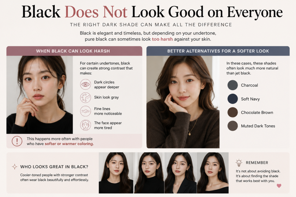
One of the biggest surprises for many people is realizing that black is not universally flattering.
Black is often considered elegant, slimming, and timeless. But depending on your undertone, pure black can sometimes look too harsh against the skin.
For certain people, black creates strong contrast that makes:
- dark circles appear deeper
- skin look gray
- fine lines more noticeable
- the face appear more tired
This happens more often with people who have softer or warmer coloring.
In those cases, charcoal, soft navy, chocolate brown, or muted dark tones may look much more natural than jet black.
Meanwhile, cooler-toned people with stronger contrast often wear black beautifully because it harmonizes with their natural features.
Warm Colors vs Cool Colors
A major part of personal color theory is understanding warm and cool tones.
Warm-toned people usually suit:
- peach
- camel
- olive
- warm beige
- coral
- golden brown
Cool-toned people often look better in:
- icy pink
- blue-based red
- lavender
- cool gray
- navy
- berry shades
When someone wears colors from the opposite category, the imbalance can make the skin appear less healthy.
For example, a warm-toned person wearing icy gray may suddenly look pale and drained.
Meanwhile, a cool-toned person wearing overly yellow or orange shades may appear sallow or tired.
Sometimes the “Pretty” Color Is Not Your Color
This is something many people struggle with.
A color can be beautiful on its own but still not suit your face.
You might love a trendy lipstick, sweater, or hair color online, but when you try it yourself, something feels slightly off.
That does not mean the product is ugly.
It simply means the undertone may not harmonize with your natural coloring.
This is why copying celebrity colors exactly does not always work. Even small differences in undertone can completely change how a shade interacts with the skin.
Makeup Can Look Different Depending on Color Harmony
Have you ever noticed that certain makeup looks seem effortless on some people but heavy on others?
Color harmony is often the reason.
The wrong blush tone can make redness more obvious.
The wrong lip color can emphasize yellow tones in the skin.
The wrong eyeshadow can make the eyes look tired instead of defined.
On the other hand, when makeup matches your undertone well, the entire face tends to look smoother and more balanced.
This is why many makeup artists focus on undertones first before choosing colors.
Hair Color Can Also Affect How Tired You Look
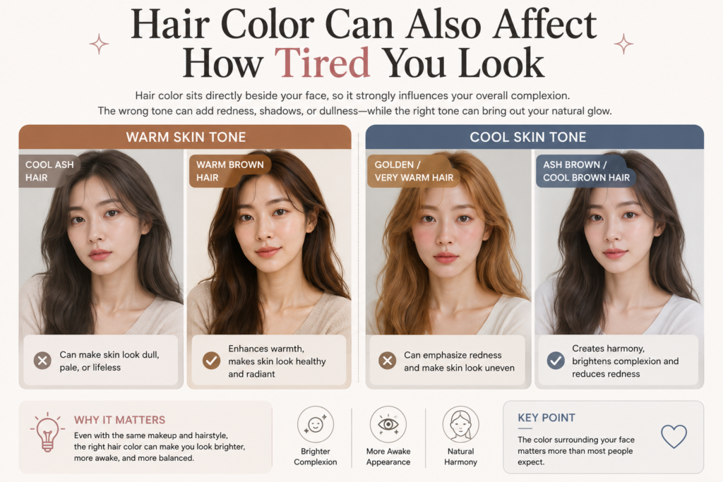
Hair color sits directly beside the face, so it strongly influences overall complexion.
Cool ash tones may make warm-toned skin appear dull or lifeless.
Meanwhile, very golden hair can overwhelm cooler complexions and create redness.
This is one reason some people feel dramatically different after changing their hair color — even when the haircut itself stays the same.
The color surrounding your face matters more than most people expect.
Lighting Makes Everything More Noticeable
Interestingly, colors that seem acceptable indoors may suddenly look terrible in daylight.
Natural sunlight reveals undertones much more clearly.
This is why some outfits or makeup looks appear fine at home but look completely different in photos or outside.
It is also why many personal color consultations use natural lighting instead of strong artificial studio lights.
The Goal Is Not Perfection
One of the biggest misconceptions about personal color is that there are “forbidden” colors.
That is not really true.
You can still wear colors outside your ideal palette if you enjoy them. Styling, makeup, hair, and accessories can all change the overall balance.
The real purpose of personal color is simply understanding why some shades naturally make you look more rested, healthy, and vibrant.
Once people start noticing this effect, they often become much more intentional about:
- clothing colors
- makeup choices
- jewelry
- hair color
- even phone case or accessory colors near the face
Because surprisingly, small color differences can completely change first impressions.
Sometimes looking brighter is not about wearing more makeup at all.
Sometimes it is simply about wearing colors that already work with you instead of against you.
Leave a Reply